markdown-it-fitmedia
A markdown-it plugin to set aspect-ratio of responsive images, make them lazy loading, async decoding, and to make videos responsive.
Images
Responsive images can create cumulative layout shifts (CLS) when loaded, because it´s difficult to get their height correct when their width is flexible. Check „Setting Height And Width On Images Is Important Again“ to get a comprehensive view about the problem. The CSS property aspect-ratio is around the corner and will help solving the CLS problem for responsive images.
The markdown-it-fitmedia plugin makes use of aspect-ratio by analyzing each of your referenced images, determining its dimensions, and setting the aspect-ratio based on the dimensions of the image. By default, the plugin will also add the loading="lazy" and decoding="async" html attributes to your images.
Example:
will become
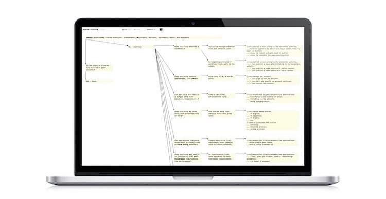
<img alt="Image of Spitfire tool" src="/img/spitfire/spitfire.jpg" loading="lazy" decoding="async" style="aspect-ratio:750/388;" width="750" height="388">Also, html in your markdown, like for example
<figure>
<img alt="" src="/img/spitfire/spitfire.jpg" >
<figcaption>Image of Spitfire tool</figcaption>
</figure>
will be transformed into
<figure>
<img alt="" src="/img/spitfire/spitfire.jpg" loading="lazy" decoding="async" style="aspect-ratio:750/388;" width="750" height="388">
<figcaption>Image of Spitfire tool</figcaption>
</figure>
Wrapping media
markdown-it-fitmedia carries an adoption of the original fit-vids script to make iframe and video tags responsive. Embedded videos are not automatically responsive or fluid. They come with a fixed setting for width and height. To make them responsive while keeping aspect ratio, they are embedded into a wrapper element. The wrapper receives some clever padding and positioning, and as a last step the fixed dimensions are removed from the video. The technique has been described by Thierry Koblentz in his A List Apart article “Creating Intrinsic Ratios for Video” in 2009.
For example, this
<iframe src="https://player.vimeo.com/video/304626830" width="600" height="338"></iframe>will become
<div class="fit-media" style="position:relative; height:0; padding-bottom:56.333333333333336%;aspect-ratio:600/338;">
<iframe src="https://player.vimeo.com/video/304626830" style="position:absolute; top:0; left:0; width:100%; height:100%;">
</iframe>
</div>
Install
npm i markdown-it-fitmediaUsage
var markdownIt = require('markdown-it');
var markdownItFitMedia = require('markdown-it-fitmedia');

markdownIt({
    html: true
    })
    .use(markdownItFitMedia, {  //default options
        imgDir: '',
        lazyLoad: true,
        decoding: 'async',
        aspectRatio: true,
        imgSizeHint: true,
        fitWrapElements: ['iframe', 'video']
    });
Configuration
imgDir, default is'': Define the directory where images are stored. The given string will be prepended to thesrcpath of the images you are using in your markdown to load and analyze an image for dimension detection. Example use case: I´m using this plugin during buildtime for my 11ty powered blog. There I have a source directory and a destination directory for the created site. The source directory is/contentand images are stored in/content/img. During buildtime the images are getting copied into the destination location, where/contentwill be removed, so that the resulting images can be referenced in the html with/img/…. However, markdow-it-fitmedia needs to access the images in the source directory, therefore, in this case, I´m configuringimgDir: './content'.lazyLoad, default istrue: Whentrue, images will receive the html attribute-setting ofloading="lazy".decoding, default is'auto': Will set the value of thedecodinghtml attribute for images.aspectRatio, default istrue: Whentrue, the CSS propertyaspect-ratiois set on images and wrapped media.imgSizeHint, default istrue: Whentrue, images will receive the html attributes ofwidthandheightas a size hint.fitWrapElements, default is['iframe', 'video']: Define the html tags to be put into a responsive wrapper.
Comments